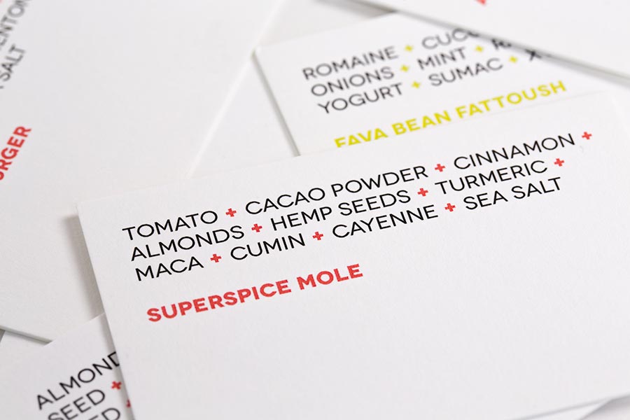
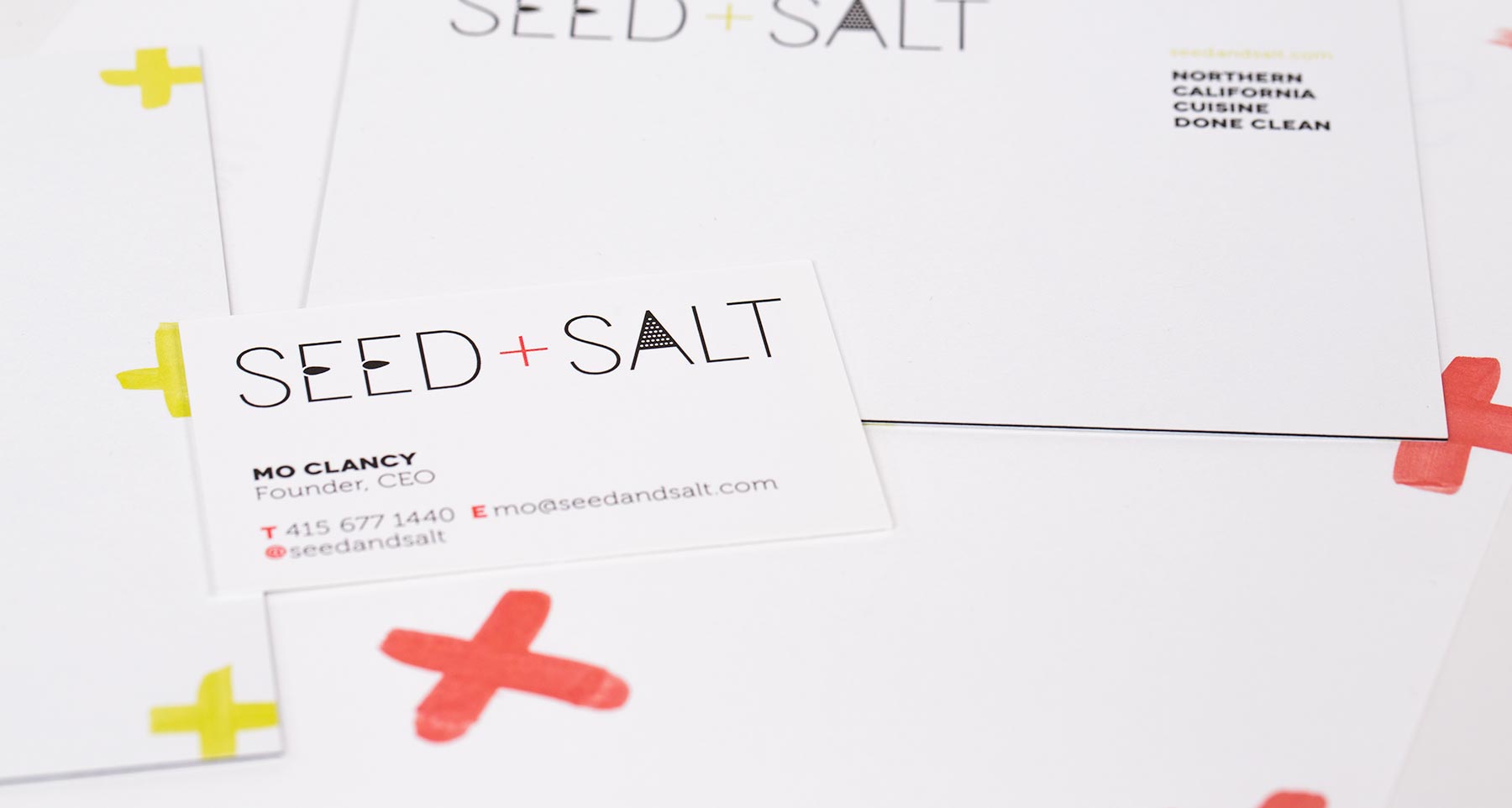
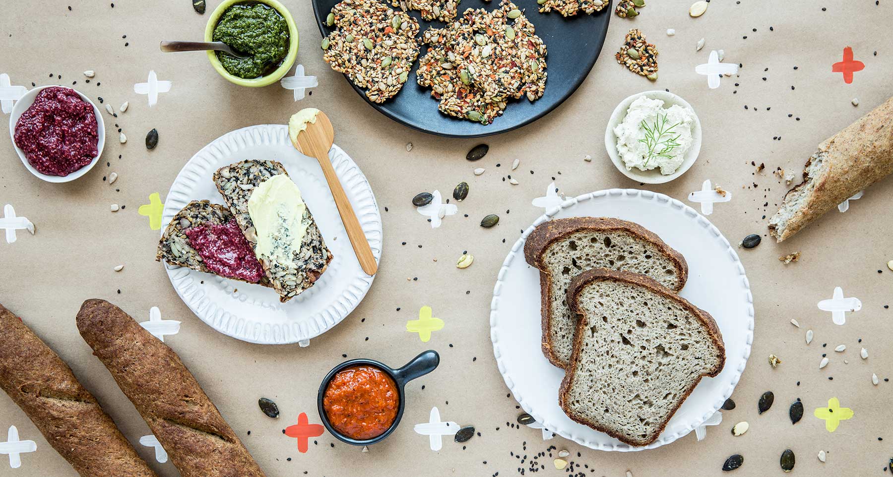
Seed+Salt believes eating healthy can be a desirable, mouthwatering experience. Our creative team joined on as an early-stage partner to provide guidance on the name, copywriting, and logo and packaging design. The result embraces a lust for life with bright pink and green color accents, friendly bold type, playful use of the “+”, and witty copywriting.
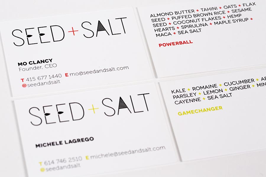
The Seed+Salt workmark is modern but crafty, like the food, with a cheeky copy personality.
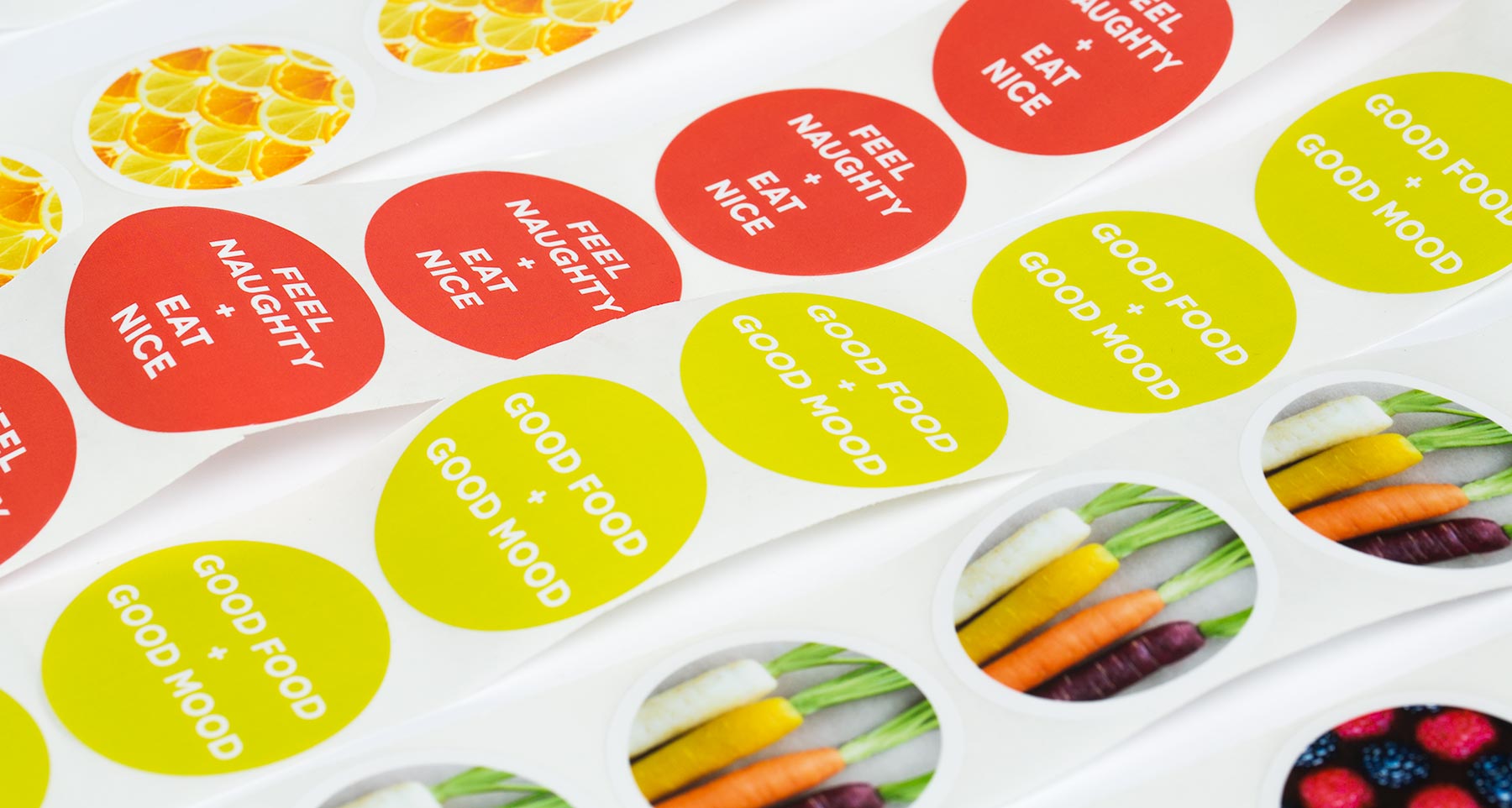
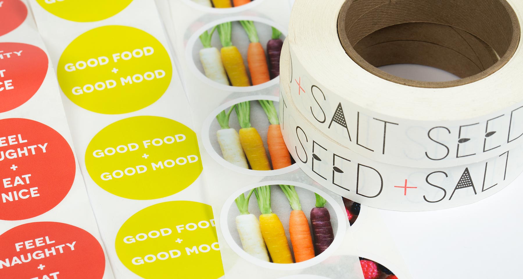
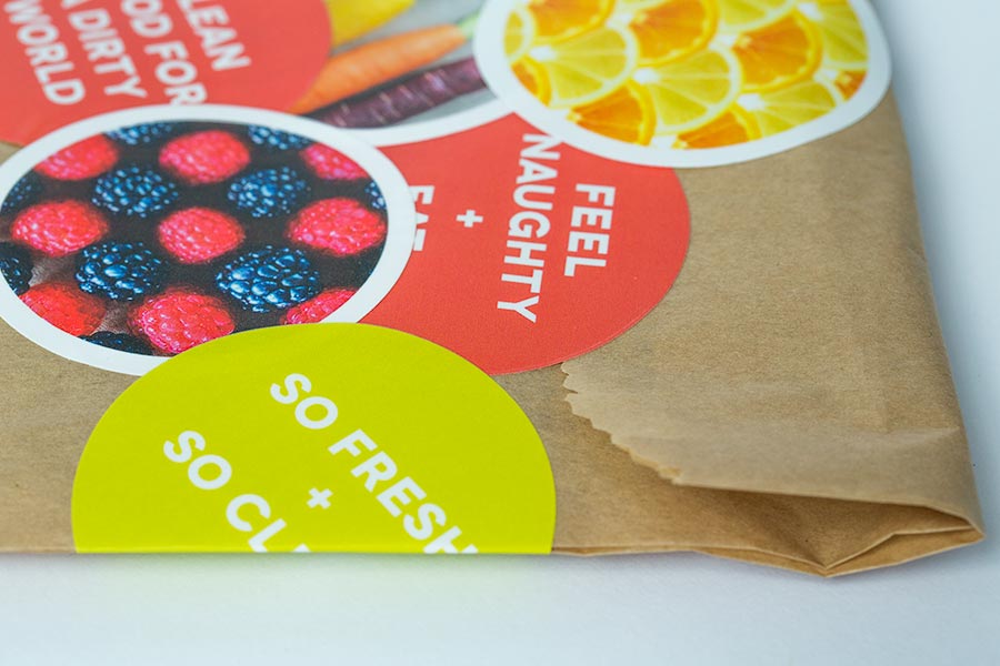
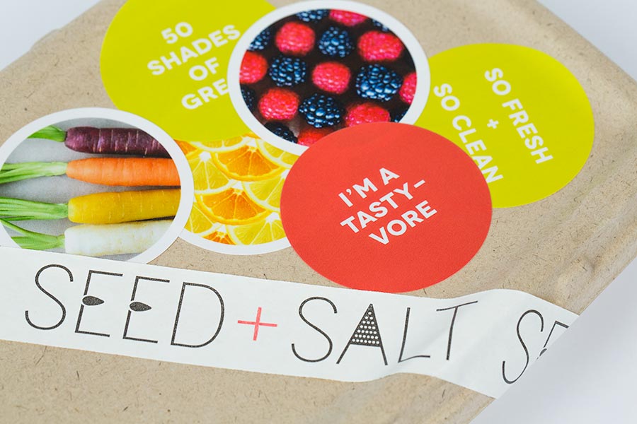
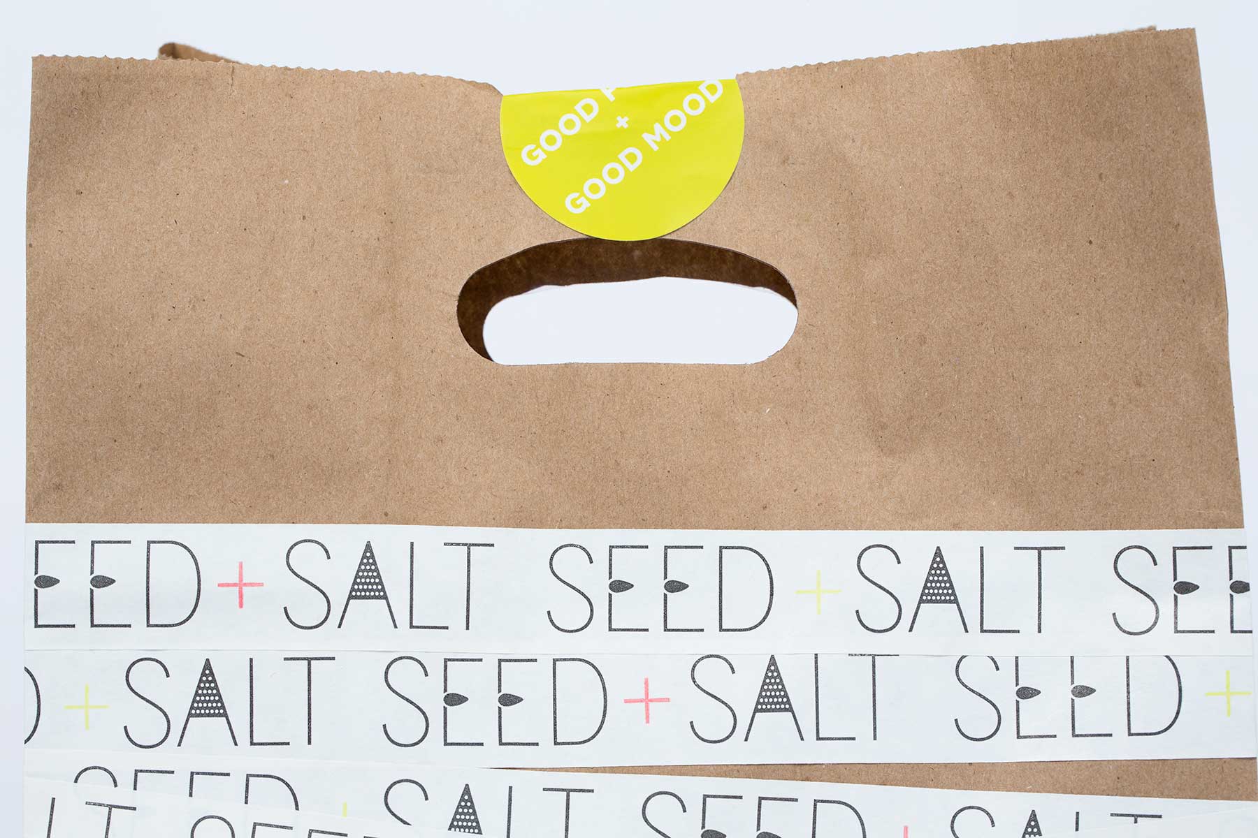
A flexible, cost-effective packaging system was key to Seed+Salt’s takeout & catering arm. We used off-the-shelf cardstock takeaway boxes with colorful, branded packing tape and graphic stickers that can be composed on the fly to bring out their brand voice in all customer touch points.
Creative Directors: Jiae Kim, John Lee
Art Director/Designer: Sunnie Guglielmo, Jiae Kim
Photographer: Lauren Godfrey,
Food Stylist: Lauren Godfrey